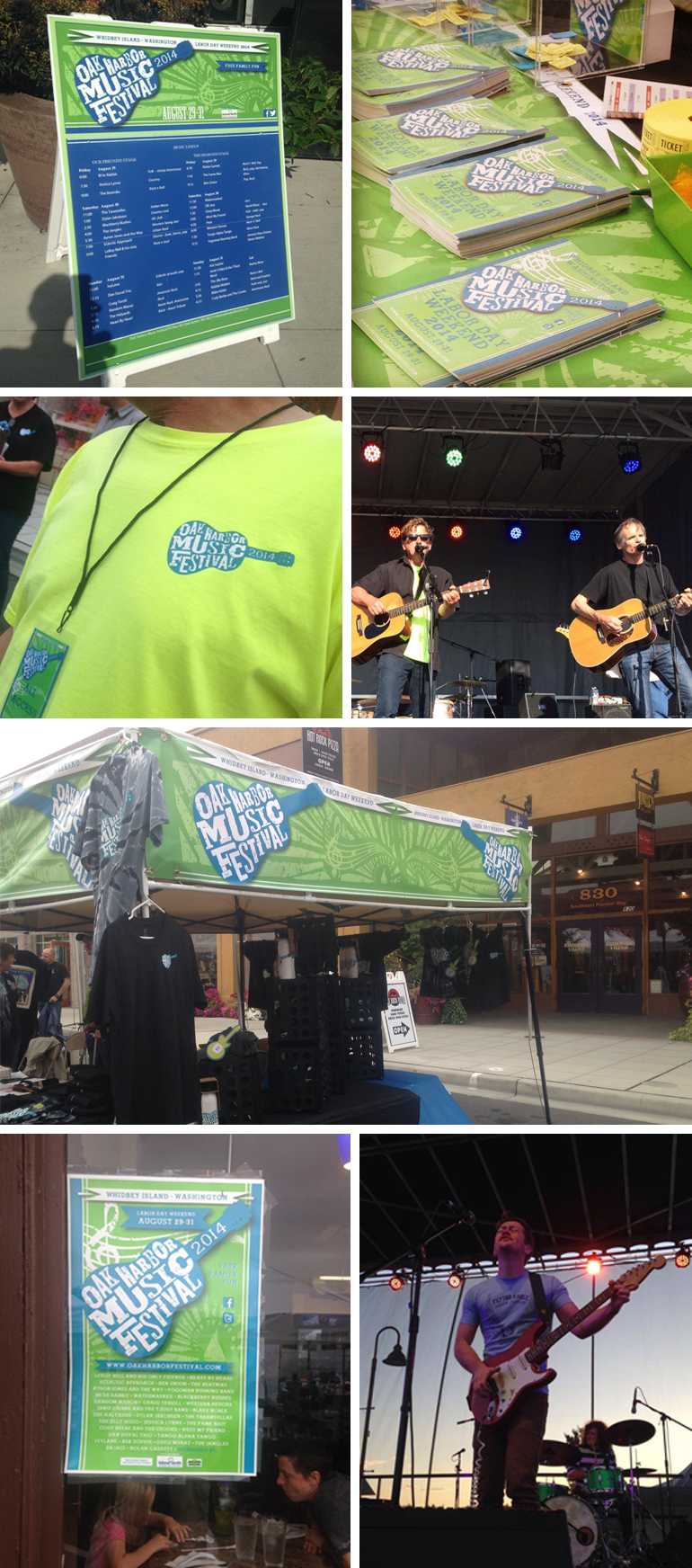
We had the pleasure of designing the logo for the Oak Harbor Music Festival so of course, we HAD to go and see it in action! This logo is also a nice example of how different areas of design expertise often come together for a final piece.
When we initially thought about this logo concept, we knew we wanted it to feel loose and rough. After playing around with what seemed like a million typefaces and layouts, we eventually landed on a font designed by Kevin Cristopher of KC FONTS. Thanks, Kevin!
oakharborfestival.com
kcfonts.com

