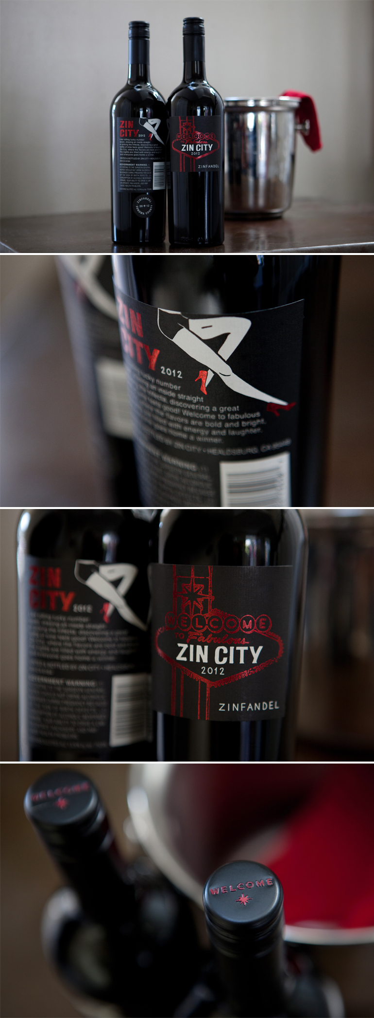
Welcome to Zin City

IN THE STUDIO

When Zin City Vineyards approached us about doing a wine label for their newest Zinfandel, we jumped at the opportunity. They wanted to play off the flash and glitz of Las Vegas. Our favorite projects are when clients want to move away from what’s expected. We went all in – complete with sexy legs, metallic high heels and neon red lights.

Zin City

photo credit: carol vaziri


City of Love

IN THE STUDIO

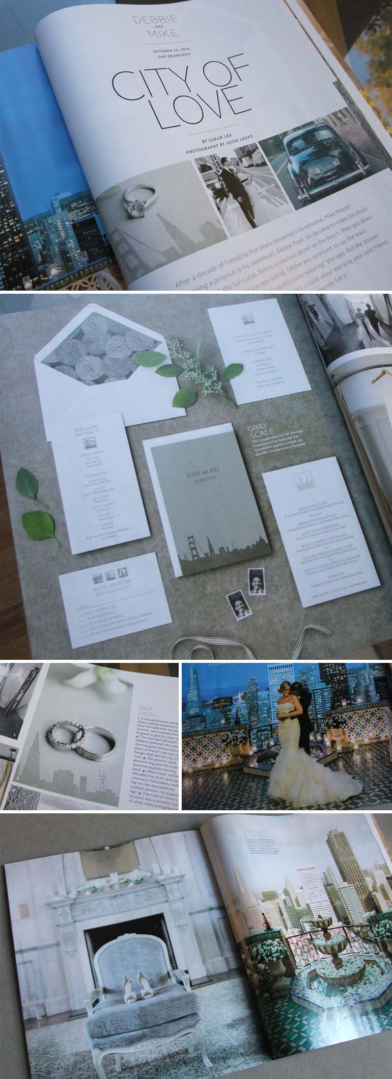
The annual 7×7 Weddings issue just came out and featured one of our favorite bride and grooms from 2014. Debbie and Mike wanted an SF-themed invitation design so we featured the skyline on a gray scale folder. Inside, the bright white printed pieces highlighted some more fun Bay Area icons – a cable car, the Ferry building, the Golden Gate… We tied the whole suite together with a gorgeous silver floral handmade paper for the envelope liner.

7x7FrostWedding2


Rustic elegance for a Tahoe Wedding

IN THE STUDIO

Lizzie and Keith planned to marry at their gorgeous family home in Lake Tahoe and really wanted to create a balance between the rustic and the elegant. We decided to work with a natural palette of whites and browns but found ways to keep that from feeling too homespun. 

For the save the date, we created a whimsical illustration of the couple’s favorite cabin and printed the card in tan letterpress on soft white paper. For the invitation, we flopped the colors, using white foil on a heavy kraft stock, and used only the image of the trees for the graphics. For an added layer of texture and elegance, we found a gold, handmade paper to use for the envelope liner. All the printed pieces are varied but the common colors and interwoven graphics tie everything together perfectly.

Event Planning: MAP Events
Floral Design: Radeff Design Studio
Photography: Catherine Hall Studios
Invitations: A Day in May

BullWedding


Happy New Year!

IN THE STUDIO

A heartfelt thank you to all of our clients and partners for a wonderful year filled with good design and beautiful events. We wish you and yours a safe and happy New Year.

Cheers!

Cheers2


A December Wedding

IN THE STUDIO

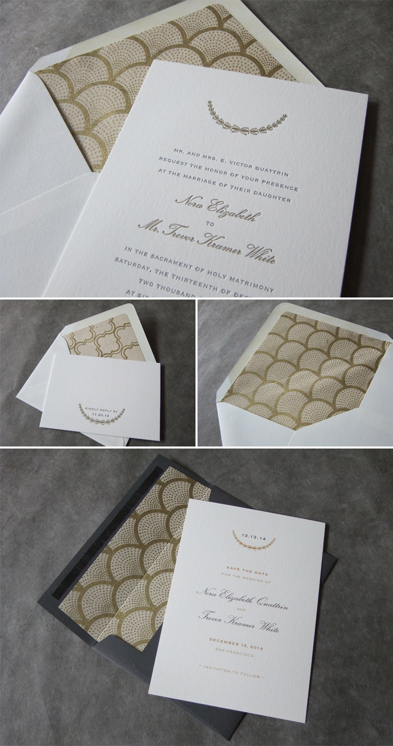
We love the simplicity of this wedding invitation and save the date. The clean fonts and a gold and gray palette paired with a modern laurel design and beautifully patterned envelope liners, makes for a festive and elegant December wedding suite.

Quattrin

Past Holiday Cards

IN THE STUDIO

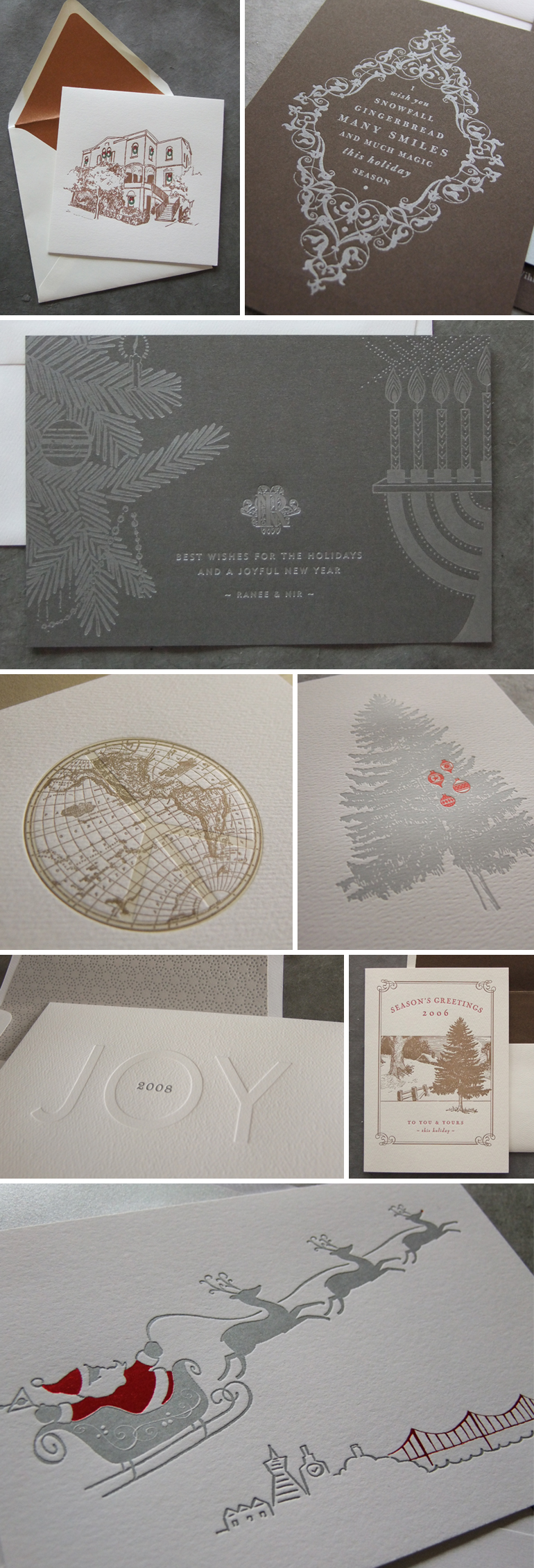
We just wrapped up all the holiday card designs for this year and wanted to stop for a moment for a look back at some of our favorite designs from seasons’ past.

PastHolidayCards


Pine Needles

IN THE STUDIO

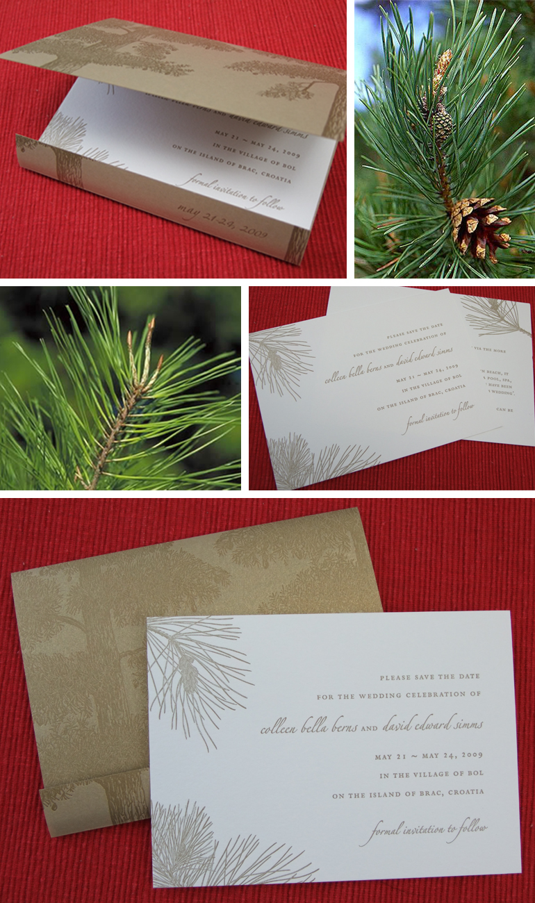
We’re nostalgic for the smell of pine needles throughout the holiday season. Take a peek at this wedding invitation we did a few years ago where we printed the folder with monochromatic pine trees and brought in the little details of branches and needles to the inside, delicately accenting each card.

Berns2

Bold Menus

IN THE STUDIO

We’re all working on our holiday menus this week. Take a look at some of these bright and bold menus from some recent events for some inspiration.

Happy Thanksgiving!

BoldMenus


The San Francisco Skyline

IN THE STUDIO

San Francisco is filled with iconic landmarks – the Golden Gate Bridge, the Transamerica Building, Sutro Tower – they are really fun to incorporate into local party invitations. Take a look at this modern wedding suite from just last month – we even got the trolley in there!

Calligraphy by Janis Anzalone

FrostWedding

Rustic Elegance

IN THE STUDIO

Lexie and Mark knew what they wanted right from the start – a rustic invitation design that still had plenty of elegance. We used a great big oak tree printed in matte gold as the focal point for the invitation and paired that with soft green type and a wood grain backboard. For the menu, we kept the rustic element with kraft paper but used white foil stamping for an unexpected polish. Stanlee Gatti brought his uncomparable talent to the wedding day design – raw, unfinished wooden walls juxtaposed with elegant florals and linens. We just love the branches and lanterns hanging from the rafters!

Event & Floral Design: Stanlee Gatti
Wedding Planner: Stanlee Gatti and Aloe Events
Photographer: Hilary Hood Photography
Wedding Gown: Jin Wang
Bridesmaids Dresses: Gregory Parkinson
Calligraphy: Michele Papineau

LexieGeorgeWedding2

Black and Orange

IN THE STUDIO

With Halloween this week (and the Giants in the World Series!), we’ve got black and orange on our minds. Here’s a fun look back at some of our black and orange invitation designs…

Halloween3


Ever After

IN THE STUDIO

We loved working on this invitation. Not only is it easy to get inspired by Cavallo Point Lodge, but we loved the soft palette of this entire wedding (the Golden Gate Bridge doesn’t always have to be red!). Wedding Planner, Stacy McCain, brought the whole look together with gorgeous florals by Atelier Joya. And don’t you just love that dusty pink dress?!

Wedding Planner: Stacy McCain 
Photography: Sabine Scherer
Floral Design: Atelier Joya
Venue: Cavallo Point Lodge
Calligraphy: Barbara Callow
Invitations: A Day in May

HaywardWedding

Ode to the Calligrapher

IN THE STUDIO

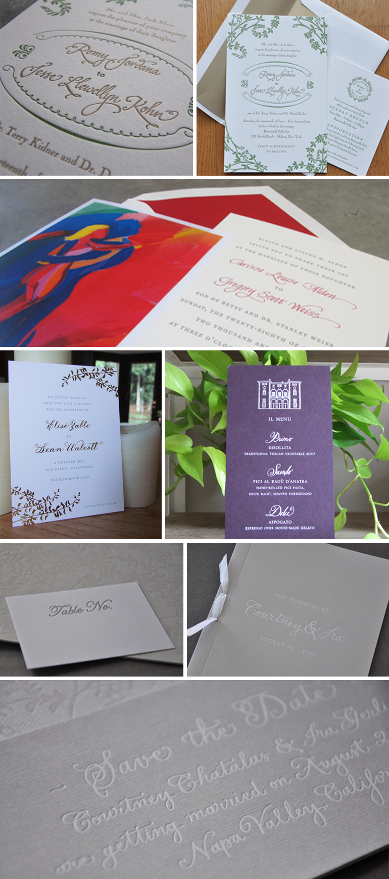
Let’s face it, we all wish we had better handwriting. Fortunately, for us common folk, there are some very talented calligraphers in this world that make the written word look oh-so-beautiful. So much so that we often incorporate it into our designs. Whether it’s simple or embellished, classic or modern, subdued or playful, here are some examples of how integrating the work of skilled calligraphers can elevate your design.

Featured below: Tara Jones, Michele Papineau, Barbara Callow

CalligraphyCollagev4


Wine Country Wedding

IN THE STUDIO

There’s a reason Napa and Sonoma are such popular spots for weddings – they are absolutely breathtaking. Our goal is to make sure that the invitations we create for a wine country wedding don’t veer into a cliché of grapes and wine glasses! Take a peek at one of our designs.

WineCountry3


Handmade Paper

IN THE STUDIO

This past year we’ve started to incorporate handmade paper into our invitation designs by using them as envelope liners. The texture and patterns make for a fun and surprising pop of color upon opening any party envelope.

HandmadeLiner


A Touch of Pink

IN THE STUDIO

With a modern font and a subtle touch of pink chevron patterns, Lexy and Ari’s invitation popped out of the envelope. The bold yet chic printed pieces translated into a gorgeously clean and sophisticated wedding day design by Event Designer, Stanlee Gatti, and Wedding Planner, Laurie Arons. We love the gray and white combo in the midst of all that greenery!

Event Design: Stanlee Gatti Designs
Wedding Planner: Laurie Arons
Photography: Jose Villa
Calligraphy: Barbara Callow
Invitations: A Day in May

TretterWedding2

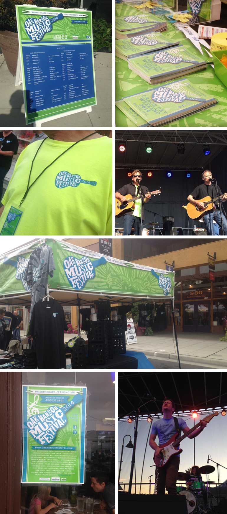
Oak Harbor Music Festival

IN THE STUDIO

We had the pleasure of designing the logo for the Oak Harbor Music Festival so of course, we HAD to go and see it in action! This logo is also a nice example of how different areas of design expertise often come together for a final piece.

When we initially thought about this logo concept, we knew we wanted it to feel loose and rough. After playing around with what seemed like a million typefaces and layouts, we eventually landed on a font designed by Kevin Cristopher of KC FONTS. Thanks, Kevin!

oakharborfestival.com
kcfonts.com

OakHarbor