Noble Folk

HOMELIFE

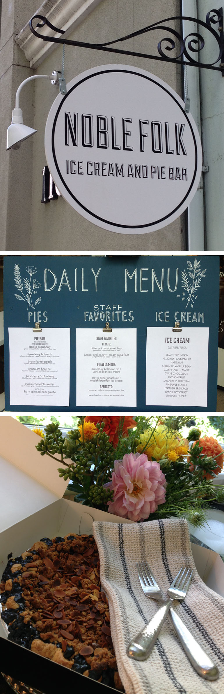
My family and I were up in Healdsburg this weekend and we stumbled upon Noble Folk – a dessert nirvana for pie and ice cream lovers. Their sweet and simple branding had me at hello, but their super original flavors and combos (rosemary ice cream topped with pistachios and marigolds!) really sealed the deal. We came home with a blueberry and blackberry pie but you can bet that I’m going back for the strawberry balsamic next time.

Visit Noble Folk HERE

LesleySignature3


LesleyNobleFolk

R+Co Hair Product

INSPIRATION

We’re suckers for great packaging. R+Co’s literally stopped us in our tracks. Hat’s off to the design director Amanda Hall. She worked with over 1000 images in order to find just the right one for each product. We love the super simple, monochromatic logo balanced against the vivid imagery.

randco.com
RandCoHair


Handmade Paper

IN THE STUDIO

This past year we’ve started to incorporate handmade paper into our invitation designs by using them as envelope liners. The texture and patterns make for a fun and surprising pop of color upon opening any party envelope.

HandmadeLiner


Scarlet Runners

HOMELIFE

My daughter picked “scarlet runners” in her school garden today – my reminder that fabulous colors don’t only exist in a Pantone book.

EveSignature

EveScarletRunners2Post


A Cup of Jo

INSPIRATION

Joanna Goddard’s blog, A Cup of Jo, is a great place to get lost for a few hours. It’s a one-stop-shop for reading about marriage, motherhood, food, beauty, and design. And it’s real. Ms. Goddard does not sugar coat. She gives it to you straight, and we all need a little straight talk once in awhile! Each post is usually accompanied by some great photography as well, so grab yourself a cup of jo and drink up.

joannagoddard.blogspot.com

CupOfJo2

photo credit: A Cup of Jo


A Touch of Pink

IN THE STUDIO

With a modern font and a subtle touch of pink chevron patterns, Lexy and Ari’s invitation popped out of the envelope. The bold yet chic printed pieces translated into a gorgeously clean and sophisticated wedding day design by Event Designer, Stanlee Gatti, and Wedding Planner, Laurie Arons. We love the gray and white combo in the midst of all that greenery!

Event Design: Stanlee Gatti Designs
Wedding Planner: Laurie Arons
Photography: Jose Villa
Calligraphy: Barbara Callow
Invitations: A Day in May

TretterWedding2

Our Favorite Children’s Books

HOMELIFE

My mom, Barbara, known as “B” to the kids, went through each of our Women Who Inspire interviews (read the wonderful interviews HERE) and bought all of the recommended children’s books for our vacation last month. She read a different book each night to her grandchildren. They loved all of them! You’re the best, B!

The Dot by Peter Reynolds
Fireboat by Maira Kalman
How to Catch a Star by Oliver Jeffers
If I Built a Car by Chris Van Dusen

LesleySignature3


LesleyBooks

Wallpaper Patterns

INSPIRATION

The perfect wallpaper pattern can really elevate a room into an elegant and sophisticated space. The same goes for invitation design. Check out some of these gorgeous Graham & Brown wallpaper designs and some of our wedding invitation designs to see how patterns can bring any object to life.

grahambrown.com

Wallpaper5

Oak Harbor Music Festival

IN THE STUDIO

We had the pleasure of designing the logo for the Oak Harbor Music Festival so of course, we HAD to go and see it in action! This logo is also a nice example of how different areas of design expertise often come together for a final piece.

When we initially thought about this logo concept, we knew we wanted it to feel loose and rough. After playing around with what seemed like a million typefaces and layouts, we eventually landed on a font designed by Kevin Cristopher of KC FONTS. Thanks, Kevin!

oakharborfestival.com
kcfonts.com

OakHarbor

Back To School

HOMELIFE

Back-to-school for us means school uniforms. I truly adore them! Perfectly simple each day – and I always love to see the personal touches that emerge as the year goes on…

EveSignature


Back-to-school2

Hold on to Summer

INSPIRATION

We’re always sad to see summer go, but with Japanese photographer Mitsuyuki Shibata’s book, Summer Bohemians, you can hold onto that Summer feeling all year long. We found ourselves literally mesmerized by these images and the design is a wonderful reminder that simple is most often best.

SummerBohemians3


Poor House in Napa

INSPIRATION

In light of the earthquake last weekend up in Napa County, we want to highlight one of our favorite stores in Napa called Poor House. Like most of the buildings in the area, they did suffer some damage from the 6.0 earthquake, but they have cleaned up and are open and ready for business.

Go visit this weekend for some fabulous housewares!

poorhousenapa.com

PoorHouse

photo credit: poor house, lonny magazine


True Love

IN THE STUDIO

We love this playful invitation for a bridal luncheon. The carved names in the bark of the tree evokes memories of sweet, young, summer love.

Katie+Matt


Nantucket Insect Walk

HOMELIFE

I’ve been with my family on Nantucket for a few days and took the cousins on an Insect Walk. They were given a map and some butterfly nets and sent off to collect bugs. The guides helped the kids place their findings in clear containers to observe and learn about the different creatures they found. The kids (and the adults!) had a blast.

LesleySignature3

LesleyInsects


Safari Inspiration

INSPIRATION

We loved working on the printed material for this baptism party. Instead of a traditional palette of blue or pink, we turned in an entirely different direction for our inspiration. The animal theme keeps it playful but the black and white color palette makes it oh so chic.

Panosv4


Envelope Liners

IN THE STUDIO

An envelope liner is a unique way to add a little something extra to any invitation. Below are a few digitally printed liners that really pack a punch with their bright colors, bold graphics, and playful patterns.

DigitalLiners


50th Wedding Anniversary

HOMELIFE

My parents had their 50th wedding anniversary this year and we celebrated with a family shindig at the beach in South Carolina. Of course, no shindig is quite complete without some proper branding, so I whipped up a logo to commemorate this special event. Fifty years of marriage was also marked by 50 years of living and travelling around the world (my dad worked for USAID), so I wanted to bring those elements all together. Here’s a peak at the logo in action (t-shirts and placemats).

EveSignature

Eve50thAnn


What Lies Beneath

INSPIRATION

We love graphics that overlap – not only does this do wonderful things with color, but shapes take on new meaning as well. For our invitations, vellum is a great way to achieve this effect. The faint overlapping gives any design a mysterious quality and hints at playful surprises that lie beneath.

OverlappingColors


An 80th Birthday

IN THE STUDIO

An 80th birthday is quite a milestone, so we wanted to make this birthday party invitation feel extra special. We incorporated the birthday boy’s love of music by printing the score of a song that he wrote himself on a metallic copper envelope liner. And to really highlight the big 8-0, we used a blind embossed hit on the save the date and cranked it up a notch for the invite with a foil stamp. I have a feeling this was a rocking party!

Getty80v3